Enterprise and SaaS Work
This page offers a high-level overview of design projects completed at my previous companies. Specific details are omitted due to the disclosures associated with them being regulated industries.
◦ Crowe LLP
A global financial services company that provides mainstream services. My current company, and one where I don several different hats on a daily basis.
What did I do there?
Meganav redesign and prototype | coming soon
Direct improvements to accessibility in production, as well as alt text guidelines documentation | coming soon
User story mapping, user flows, and UX audits | coming soon
Global inclusion and design localization | coming soon
Work directly with developers and Crowe's CMS platform (SiteCore) | coming soon
◦ Ascensus
A financial services company that provides outsourced services in the savings plan industry. My tasks were centered around Government Savings products, such as 529 accounts and the National ABLE Alliance.
What did I do there?
Designed the Idaho 529 public web site (below), which will be in production early 2024
- Designed the online ABLE enrollment process and dashboard for entities, currently in production
- Worked with developers to build pages and improve accessibility of existing applications
- Helped facilitate user story mapping sessions and client ideation workshops
- Created style guides, components, variables, modes, and prototypes for state brands
- Wrote research plans for ABLE discovery and interviews
- Conducted UX audits of current applications
- Helped user test the Ready 529 mobile application
Idaho 529 Site: simplification and accessibility
A.B.L.E. Enrollment for Entities: enrolling and managing accounts
Inclusive design insight
Working with an accessibility-enthused developer taught me a great deal about how I export and format my designs. Take a look at this example we uncovered.
Accessible solution: when designing Idaho's version of this same portfolio, we found we needed to export the pie chart only as an image.
The alt text should listed the percentage breakdown, and any other relevant text was added as HTML so it could be picked up by a screen reader.
If you inspect a pie chart on one of our existing 529 sites, you will find that the entire chart itself is an image. The alt text reads, "Aggressive."
Meaning, "Aggressive" is the only metadata anyone using a screen reader will get. They will not get the statistical breakdown or any other relevant information about this portfolio.
◦ ATPCO
A large B2B SaaS company that deals in complex airlines data. Even from the customer side, booking a flight is complicated. Imagine how much more difficult it is on the other end!
What did I do there?
- Worked with data sets and tables to simplify software that leans heavily on AG grids
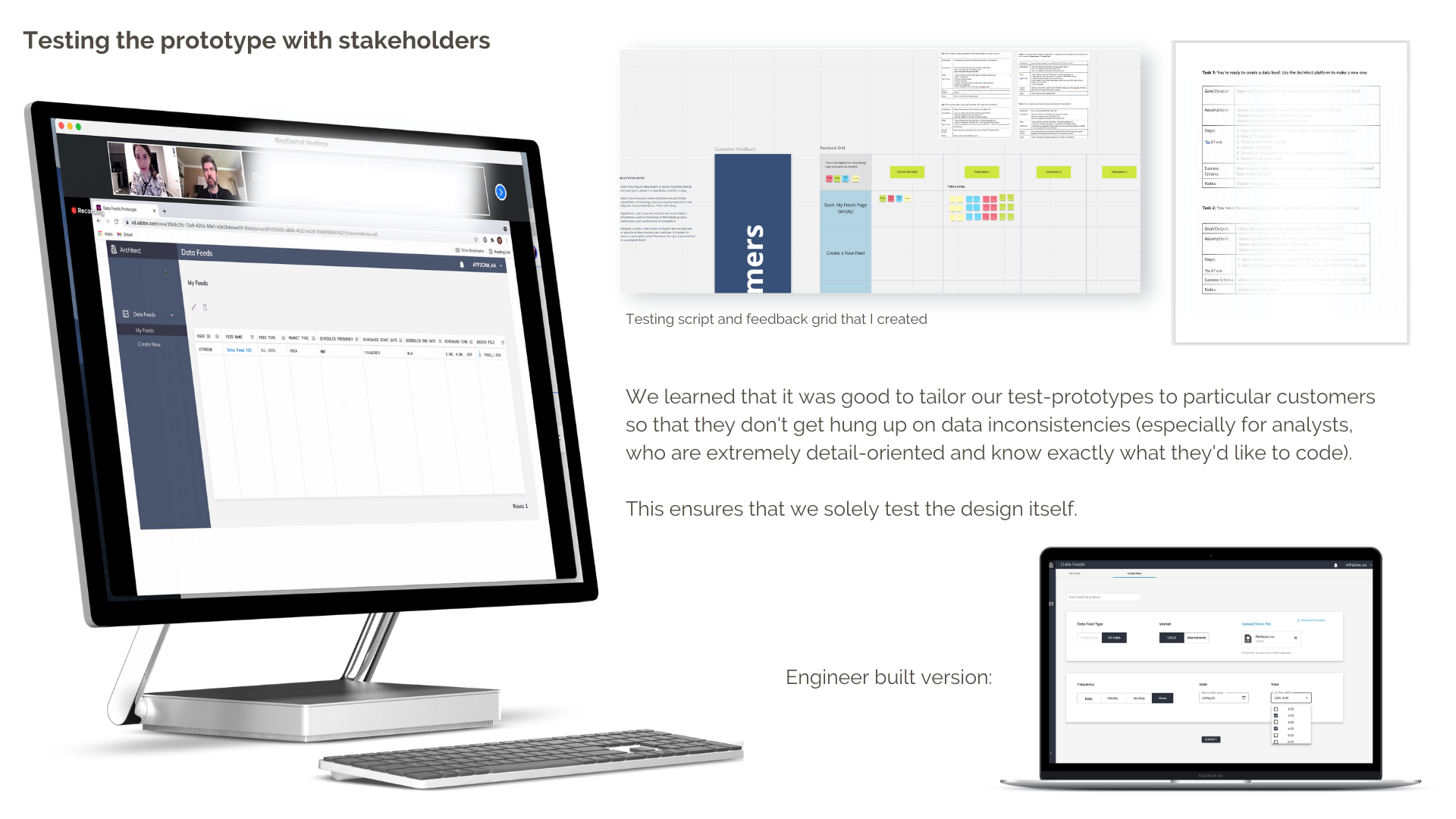
- Wrote and conducted user testing with airline stakeholders
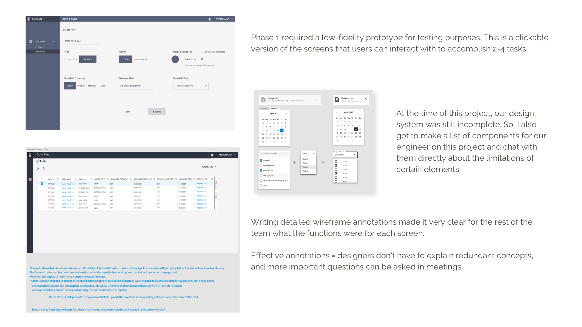
- Provided documentation and annotation for engineer handoff
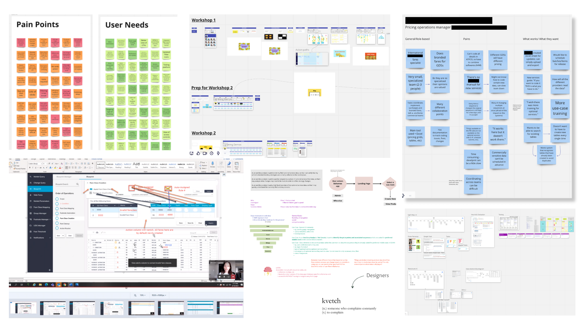
- Created user pain points from interviews to help teams make design decisions
- Drafted competitive analyses related to airline merchandising software in production
- Contributed to several projects in production that boosted company KPIs
- Utilized and added to existing design systems to improve applications' visual clutter
- Compiled presentations and guidelines on design QA
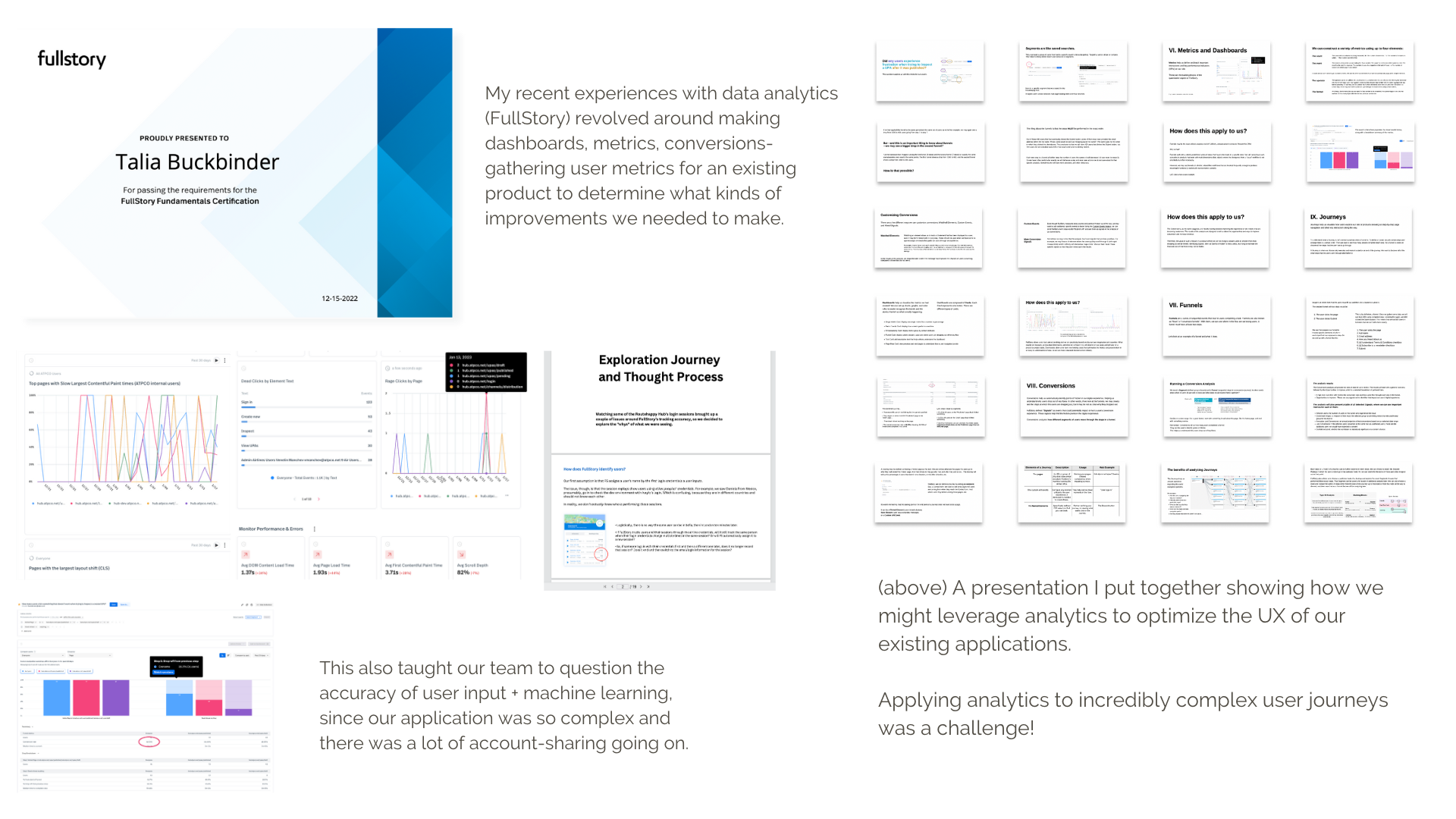
- Used FullStory analytics to compile quantitative data on Core Web Vitals for merchandising pages
- Collaborated in Miro with cross-functional teams
- Wrote user surveys for initial product research
Feature designs and redesigns I completed in production
Data Feeds: easy form submission
- Analysts go into the Architect application to create a data feed- a request to receive data from ATPCO.
- Non-existing feature in the application, so I created it from scratch.
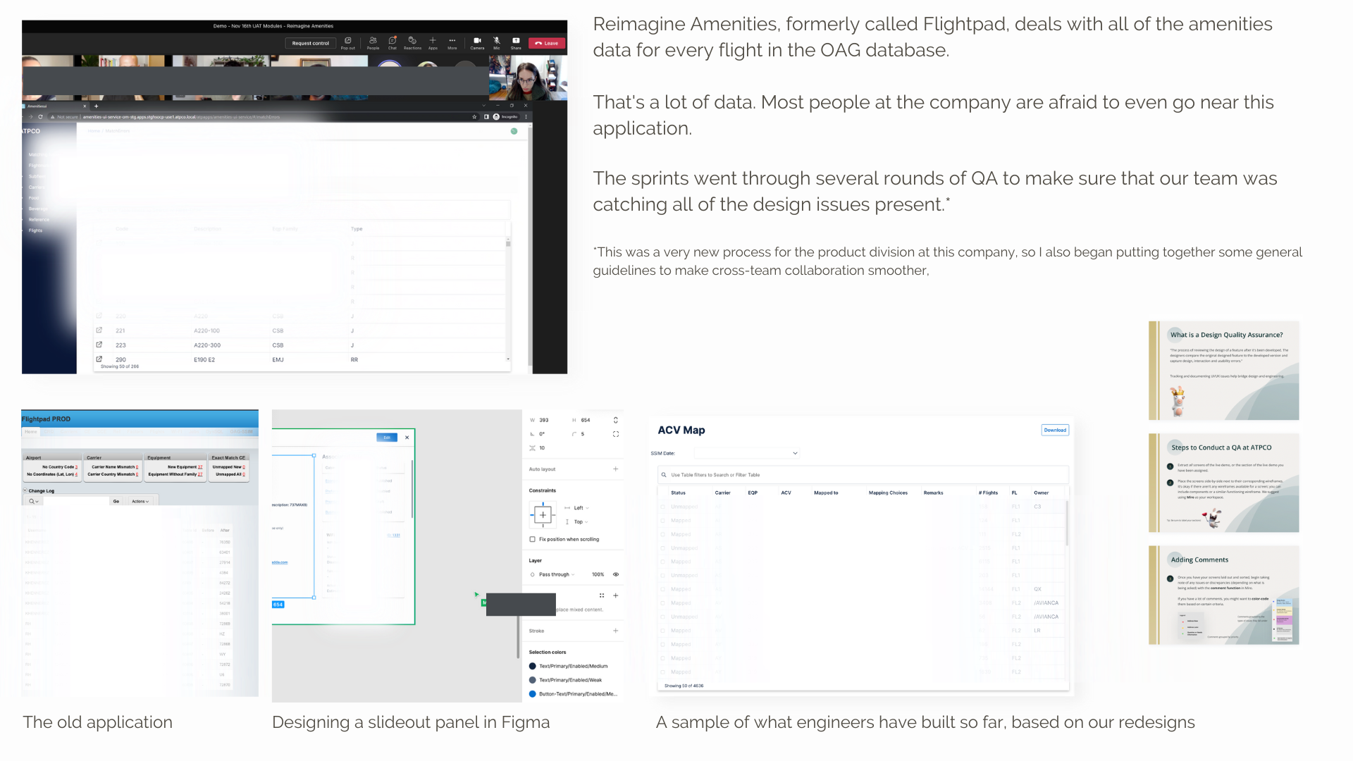
Reimagine Amenities: chunking huge amounts of data
- An existing platform to house sensitive flights data.
- Consists of mostly giant tables, and requires expert-level knowledge to use.
- Has little to no error prevention, and is only used by two power users.
- My team created wireframes in Figma with existing design system components.
- Engineers are currently building out the different modules of this platform.
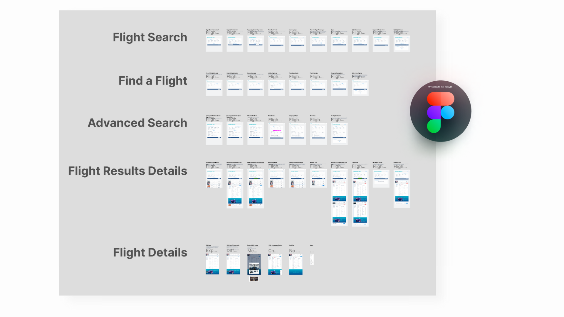
Flight Search: avoiding user confusion
- An existing feature in the Routehappy application where internal users can look up flights data.
- Created wireframes in Figma, along with new components.
- A prototype was presented at the 2022 Elevate Aviation conference.
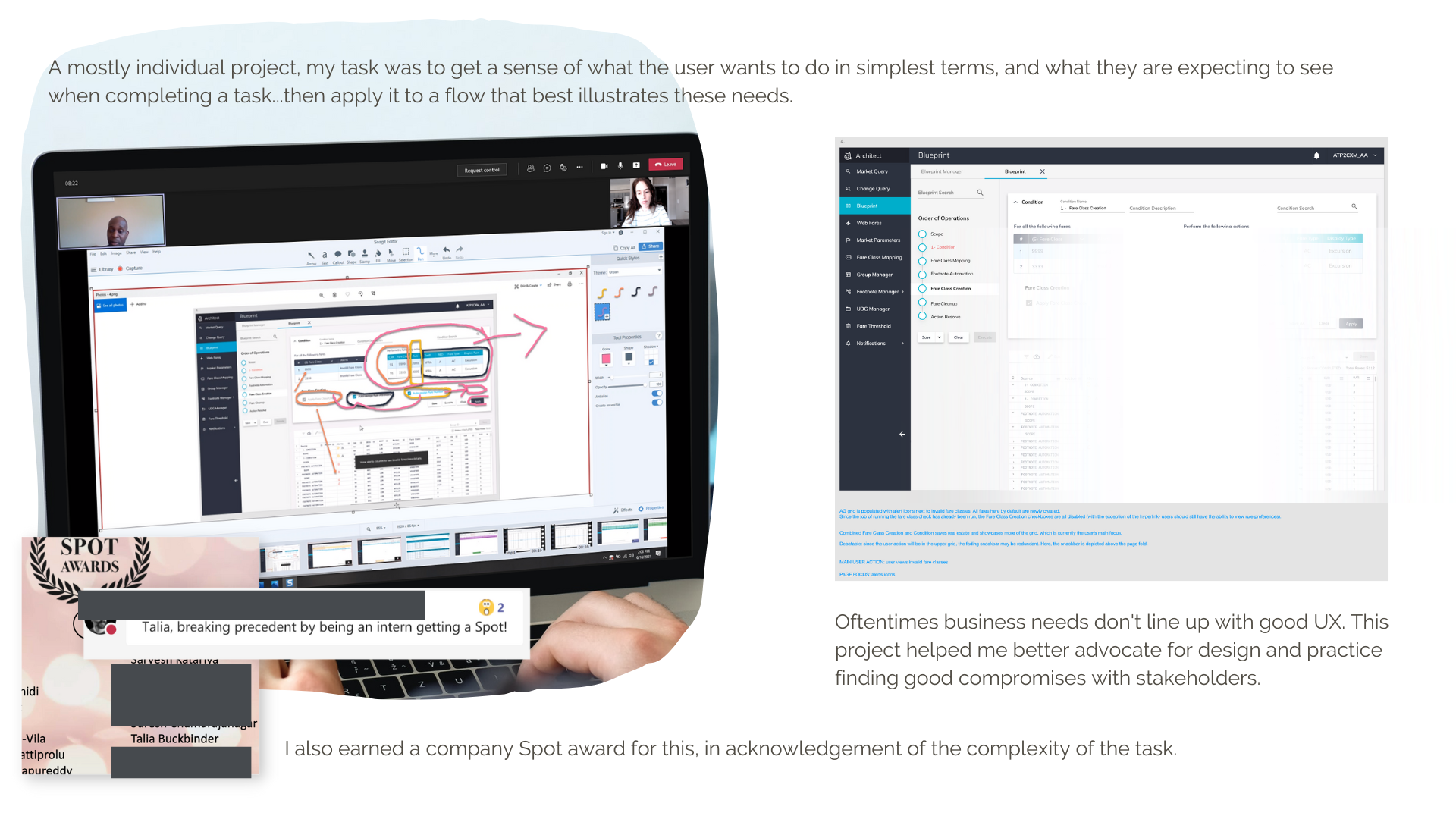
Record 1 Blueprint: expanding user freedom
- The process of creating a new fare class needed a smoother user flow.
- I worked extensively with Victor, the Business Analyst, to improve this process.
- Handed off wireframes to engineers with annotations in JIRA.
Bonus: analytics, research, and finding out the Why's
- Received a FullStory certification
- Frequently presented findings to the product teams and encouraged data-driven decisions.
